
UI Inspiration
For a few weeks now I've spent a considerable share of my development time to work on a prototype of our upcoming game title. For now I am still pretty much in the experimenting stage, trying out various different types of interfaces and playing around with different client devices (desktop, touch, mobile etc.). Beyond that, most aspects of the game are still undefined. Basically two aspects are set: The game will take place in a space setting - as our teaser site boldly states - and it will once again be a more or less serious business simulation (not a transport simulation, though).
My initial goal was to create an intuitive interface that fits both touch and regular devices equally well. But the further I got into it, the more obvious it became that there are too many tiny differences between these two worlds for my interface to work the way I imagined it. So now I'm basically back at the drawing board...this time with an initial focus on regular, desktop-based client devices.
Since I want the final result to be a proper business and management game in the fashion of the old (and not so old) classics, I'm turning to screenshots of various titles I played throughout my life as a source of inspiration. My intention is to find a decent blend of both proven and innovative concepts for the UI of Prosperous Universe.
So let's take a quick tour of what I looked at so far:

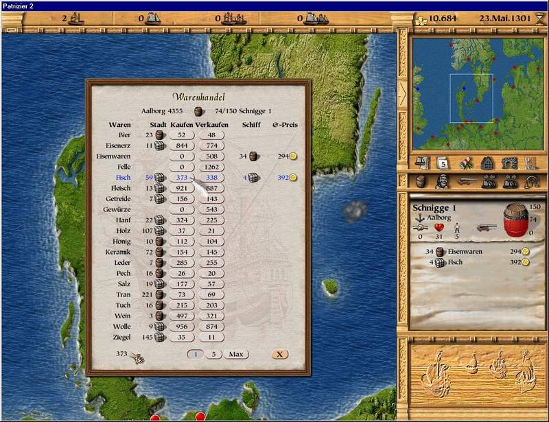
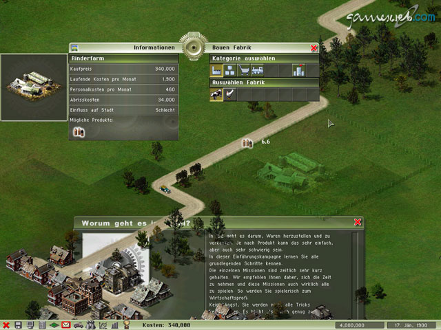
This is a screenshot from the fourth iteration within the classic Settlers series. Most controls are arranged on a single panel on the left of the screen. The same pattern can be found in most RTS games of the time. Here two of my personal favorites, Patrician and Emperor:
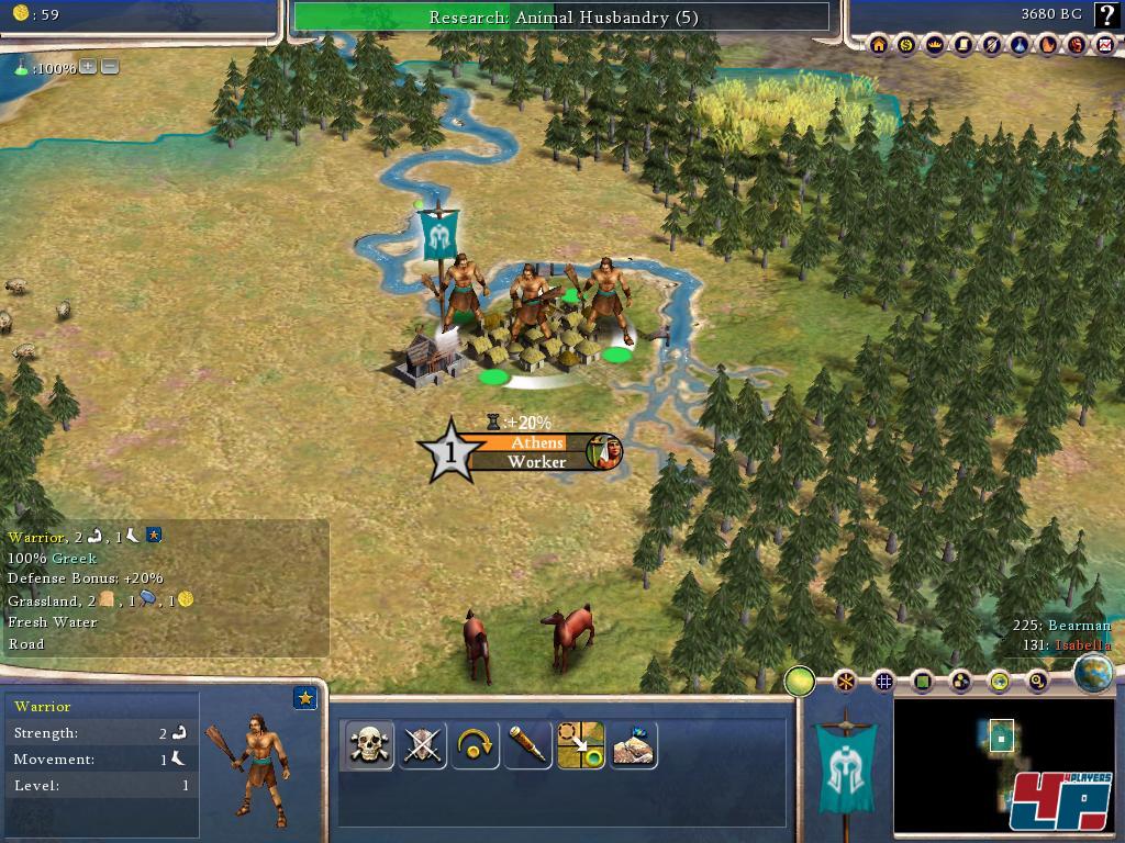
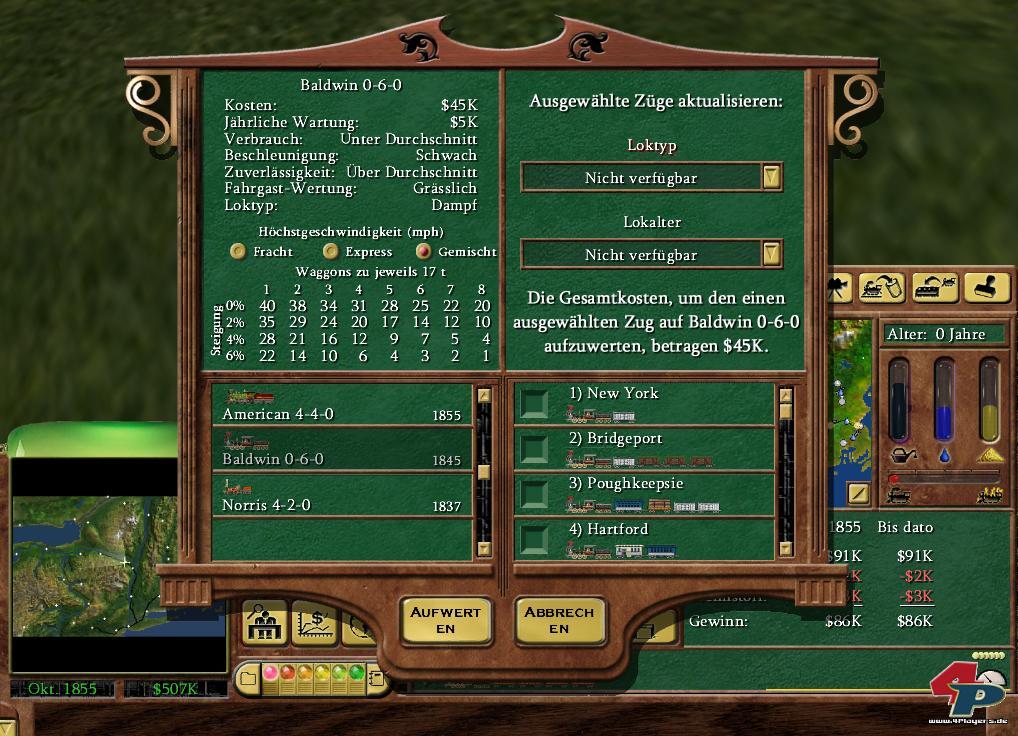
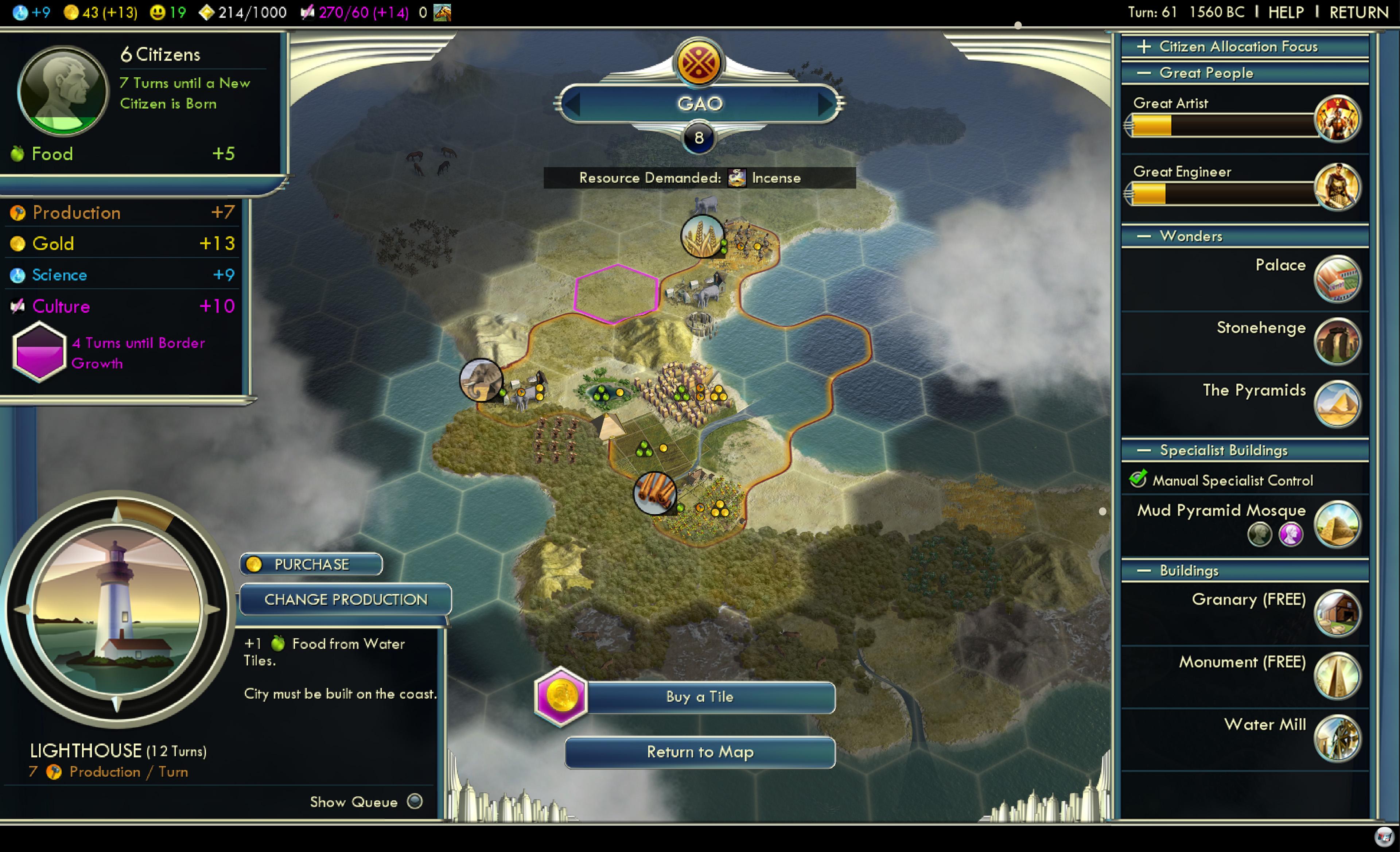
A variation of this is to align the key controls at the bottom of the screen (shown here: Civilization IV, Railroad Tycoon 3).
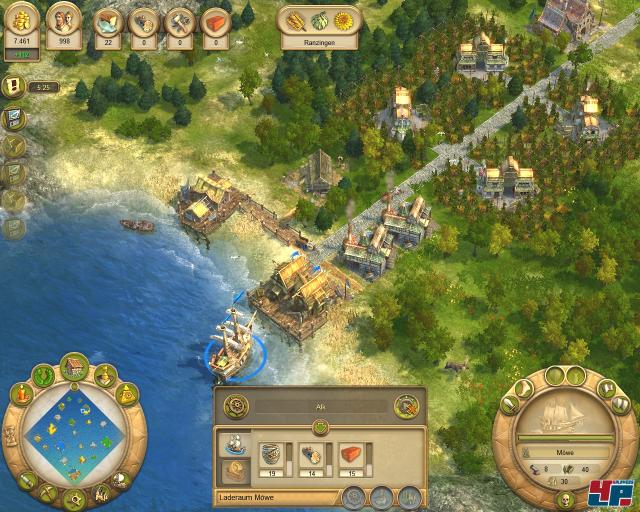
This concept is robust and familiar to most. Dialogs can be used whenever appropriate to gain more space. At the same time it's rather boring (old-school?) and it doesn't make use of large screens while obstructing a large amount of space on small screens. More recent games therefore split up the controls into widget-like components that can be placed anywhere on the screen and only be displayed when needed. One example is Anno 1701 (and likewise Anno 1404 as well as the latest iterations of the Settlers...same studio):
The interface is broken down to a very low level. For example, single widgets are used to display the amount of stored goods instead of a continuous bar that spreads across the whole screen as in older titles. Civilization V uses a blend of the concepts, featuring a broken up interface while maintaining a rather conventional look of the single boxes.
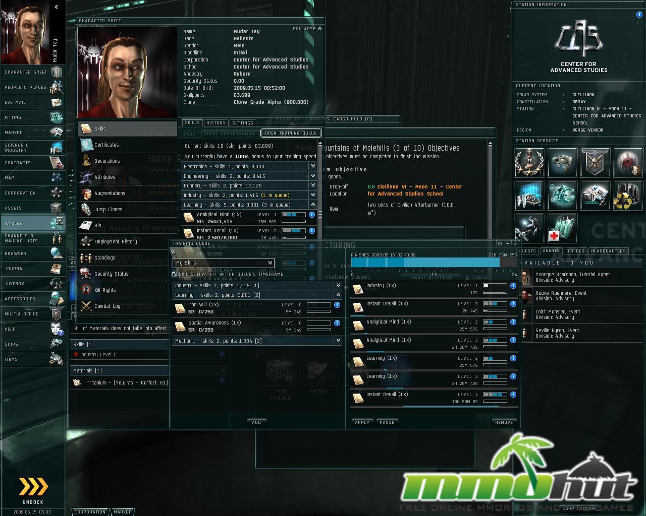
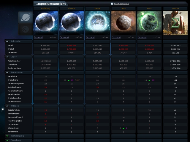
A bit closer to the theme of Prosperous Universe is Eve-Online. It is not a classic RTS game but an MMO-style 4X game within a 3D space environment. Nonetheless it features a very complex ecomomic system and an astounding level of detail. The interface reflects this with independent windows and a very high information density:
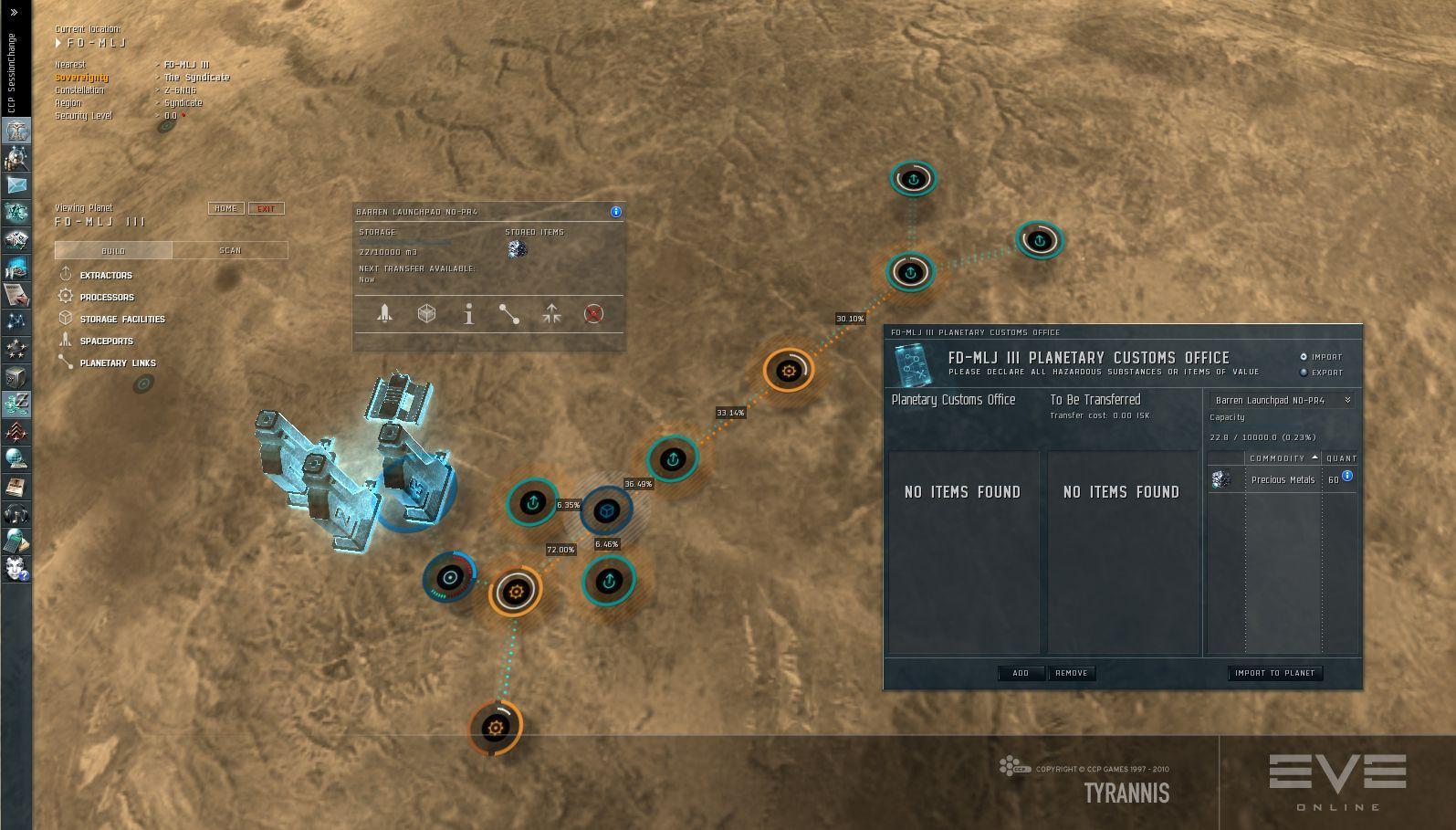
The latest add-on to Eve even allows planetary structures and employs a rather abstract but modern interface to manage the facilities:
In my opinion, the interface of Industry Giant 2 is also worth mentioning. The only constantly visible interface component is a slim bar at the bottom of the screen. Everything else is done using dialogs or, most importantly, a context-sensual component that pops up right in place whenever the user clicks an element of the game's main screen. The latest Anno uses similar methods to allow for easier and quicker construction of buildings.
It might also make sense to take a brief look at what actual browser-based space games look like today. These are two current screenshots of OGame, one of the more popular games in this field:

Maybe it's just because this is a rather old game that only got a visual update, but generally I get the impression that many of these games still feature a conservative three-column design as found in a plethora of websites. The graphics cannot hide the fact that basically everything the player is dealing with are simple tables. A problem that AirlineSim is suffering from badly and that PU is also prone to. On the other hand, this kind of design just "works" in most environments, even on touch surfaces, as there aren't many fancy UI gimmicks that could cause problems.
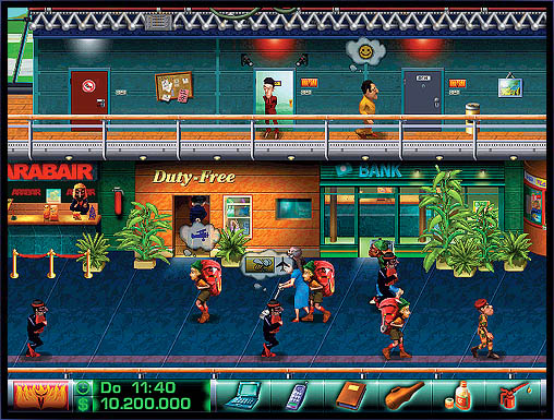
And finally, for sake of completeness, a totally different approach to game interfaces. Long live Airline Tycoon (and it's predecessors in spirit):
If you think there are important types of interfaces/games missing in my list, please let me know and send me your suggestions in the comments!